- Real Estate
- Investment
- Brand Identity
- Website Design
Alamo Equity
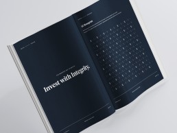
The smartest way to wealth.
Alamo Equity is a San Antonio based real estate and private equity investment manager helping clients grow their investments to their full potential by means of bringing fresh insights, resources and results with each transaction. Their name, Alamo Equity, is inspired by the iconic and powerful Texas symbol - The Alamo - and the concept of equity - which refers to the principle of treating others with dignity and honor.
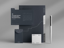
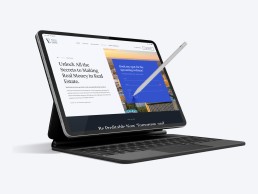
We developed a brand identity that honors these principles and introduces a fresh, yet timeless design to cement their position in the industry and create further brand recognition amongst new and existing clients. As part of the process, we also worked closely with the company to develop a new website that would clearly communicate their deep understanding of the market and solutions.


Crafting legacies with a vision of growth.


The linear motif — A rising line that runs the edge of the Alamo — is featured throughout the branding. The way it climbs up and forward is symbolic of an escalating line chart representing positive change over time.
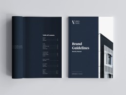
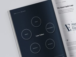
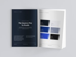
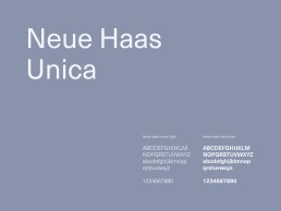
Working with Alamo Equity, our designers helped the company identify five desired core values: “trust,” “responsibility,” “integrity,” “security,” and “smart.” These values inspired us to create a color palette led by the deep "stone" blue that evokes knowledge, authority, and reliability. We selected Tiempos Headline, a modern, serif font, as the primary typeface. It’s robust and clear, perfect for economic and legible typesetting, and strikes a balance between practicality and elegance. To pair, we designated Neue Haas Unica, a sans serif font, as the secondary typeface. It's regular, medium and bold weight know no boundaries making them appropriate for a wide range of applications.